On December 4th, I did a styled holiday session with LoveMSBrickhouse. For this session I went all red with accents of gold for the set and I shot it in two ways. The first was very high key and commercial while the second went low key and editorial. I did this all with one set and just changing the lighting.
For this session I used:
|
Photography Equipment |
Props/Miscellaneous |
|
Cannon 80D Trigger 2 strobes 1 speed light 2 c-stands 1 Backdrop stands 2 light stands 2 u-hooks Painter pole Red Seamless A-clamps Sandbags 1 7-foot umbrella 1 Beauty Dish 1 Bell Reflector 1 30-degree Grid |
18-inch square wooden posing box Red wrapping paper Empty boxes Red ornaments Gold ribbon Fake poinsettias Fake miniature evergreen trees Clear plastic display stands Tape |
I got my inspiration for
this set and session from work previously done by the photographer, Lindsey Alder.
I like her work and style thus watch a
lot of her YouTube videos where she breaks down how she got the shot. She is
also very fond of doing bold colors, especially red, and dramatic lighting. Last year she did a red-on-red holiday photo
that I used as inspiration for this session. My idea was very simple and
started with wooden posing box my husband made me, I wanted to turn that into a
large present, which I did by covering it in sparkly red wrapping paper. (Note
tape doesn’t like sticking to the sparkly wrapping paper). I then added in some
other small wrapped boxes, then some poinsettias, a few small pine trees, and
strung ornaments up in the background all on top of Savage red seamless paper.
To hang the ornaments in the background we set up two light stands, placing
u-hook holders on them and then placed a painter’s pole in the hooks. I then hung
the ornaments from the painter’s pole. This allowed for some separation between
the backdrop and the ornaments while adding additional depth to the set and
final photo.
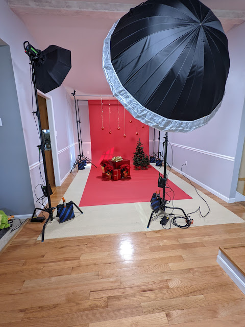
The lighting for this
set was rather simple. The main light
was coming from a strobe about 10-degrees off center to my right, which had a
7-foot umbrella with a sock on it. This light was at about ¼ power throughout
the whole session and light the scene with a nice even soft light. I then had another strobe that was about
45-degrees of center to my left with a beauty dish on it, which acted as a fill.
That one was at about 1/8 power. This
set up gave me a nice high-key commercial look.
You can see this set up below. Then when I went for the more low-key editorial
look, we switched out the beauty dish to a bell reflector with a 30-degree grid
to create more of a spot look. This light then became the main light while the
light with the umbrella became the fill light. We did not change the position
of the light stands.
Now for the actual photo
session. For this session I used an ISO of 100 and an aperture of F9, with a
shutter speed of 1/200s. I wanted to
ensure everything was in focus so went with a higher F-stop. My focal length
ranged from 28mm to 100mm with 40mm being the most common focal length. While I normally shoot very wide, the size of
the umbrella made me shoot further away from the subject and zoom so that the
umbrella wasn’t in the shot. For a majority of these photos, I was sitting on
the floor so I was shooting under the edge of the umbrella.
I had a ton of images
that I absolutely love come out of this session. My favorite is one of the last
images from the session. To get this image the strobe with the umbrella was turned
down to an 1/8 or less power. The strobe with the bell and grid on it was at
about a 1/4 power. Then I had a secret light, which was a speed light that was
being hand held by my assistant about 75-degrees of center to my right. The
speed light was zoomed to about 105mm and aimed towards the model’s face. The lighting works for this image because it
makes it very sultry and editorial image. When editing the image, I cleaned up a
few spots where you could see the backdrop stand legs, and did basic edits. I
did consider removing the ribbons coming down behind the model, but then I had
to ensure I was removing the correct shadows. I did attempt to take them out, but
realized the image didn’t look balanced so I ended up leaving the ribbons.

The next image is a
complete opposite of the first image. It is bright, high-key, and very commercial.
The image has nice even light due to super
big umbrella and just a pop of light on the model’s face due to the beauty
dish. When editing this image, I did clean up a few areas where I could see the
feet of the backdrop stands. I also removed the ornaments because how this
image was cropped only about half of the bottom portion of ornaments were
showing, thus a distraction. I also did a little bit of dodging and burning to bring
out a little more separation in the poinsettia leaves. I also some basic edits.
This made a nice clean image, that I added a vignette too just to add a bit more
depth and interest to the final photo.

As I described in the
set design and seen the set-up picture, I had a few small pine trees in the original
set. However, as I was working with the model and going through the shoot, I
determined the little pine trees really didn’t work with the overall aesthetic
of the images and were more of distraction because they weren’t red or
gold. So, I ended up removing them after
several frames. This is one of the few
images with the pine trees in the background. It might have worked if I had
more trees but then we run into the issue that the set might be too busy and
distract from the model. As you can see,
we have nice even lighting in this image giving it a nice happy feel. When
editing the image, I did basic edits and added just touch of brightness to the
model’s face. I also removed the deep shadows
within the pine trees so they had depth and did not look like dark blobs. I also used the liquify tool to help smooth
out some of areas of the dress, because the dress can be very unforgiving to even
the thinnest of models. I finished the image off with a very light vignette just
ensure it had a bit of tonal depth.

Overall, I’m very happy
with how this session turned out. I
liked working with the red on red with pops of gold as accents. The feel the
images are very refined and show how one can go from a very commercial look to
an editorial look with the same set, just by changing up the light modifiers
and strobe powers. A select number of images
from this set are expected to be published in the up coming issue of MoevirMagazine.
Credits:
Model: Lovemsbrickhouse (Instagram @lovemsbrickhouse)
MUA: Face by Scorpion
Beautiee (Instagram @facebyscorpionbeautiee)
Comments
Post a Comment